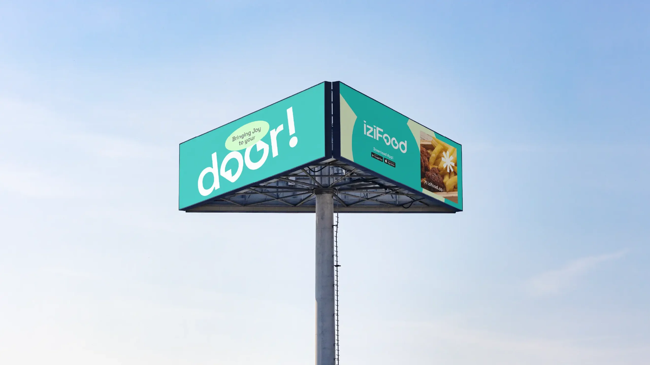
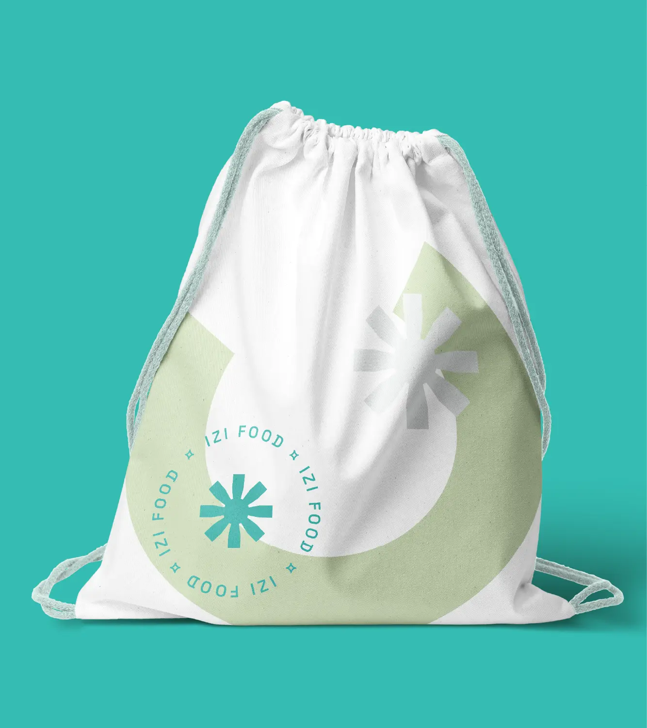
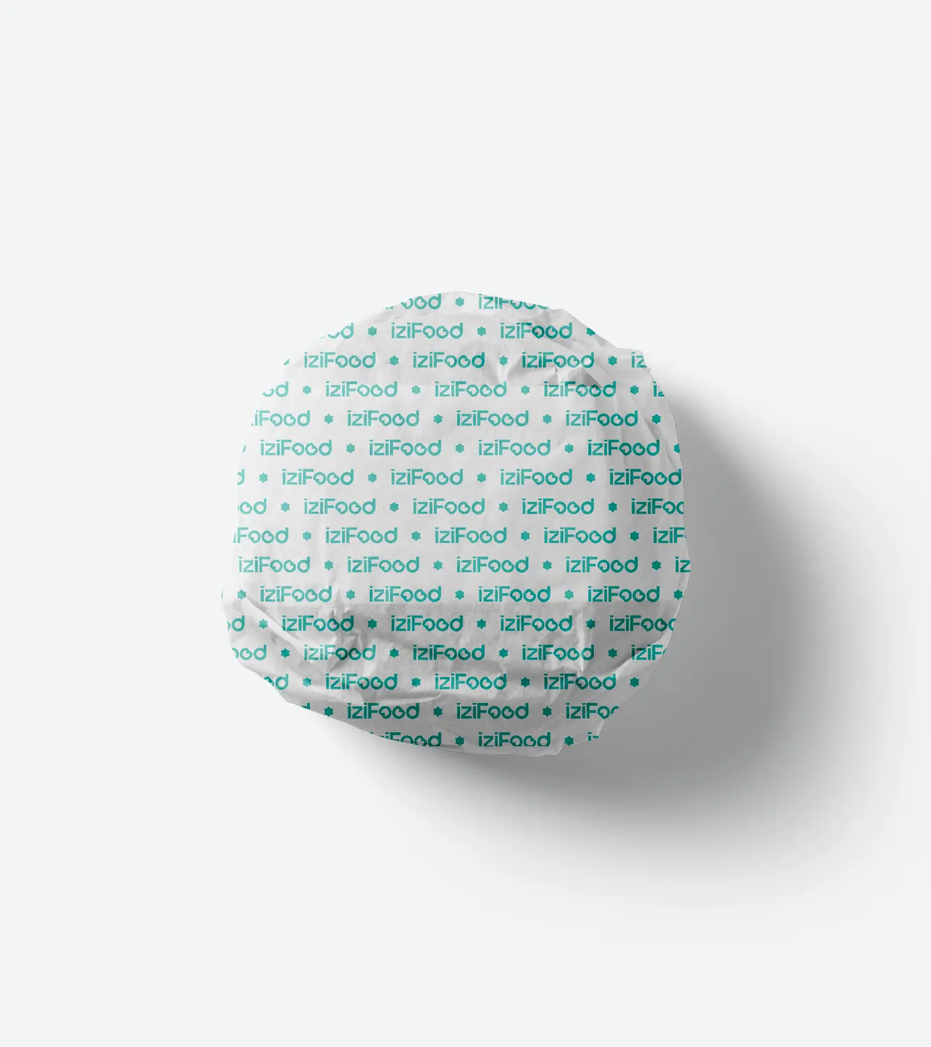
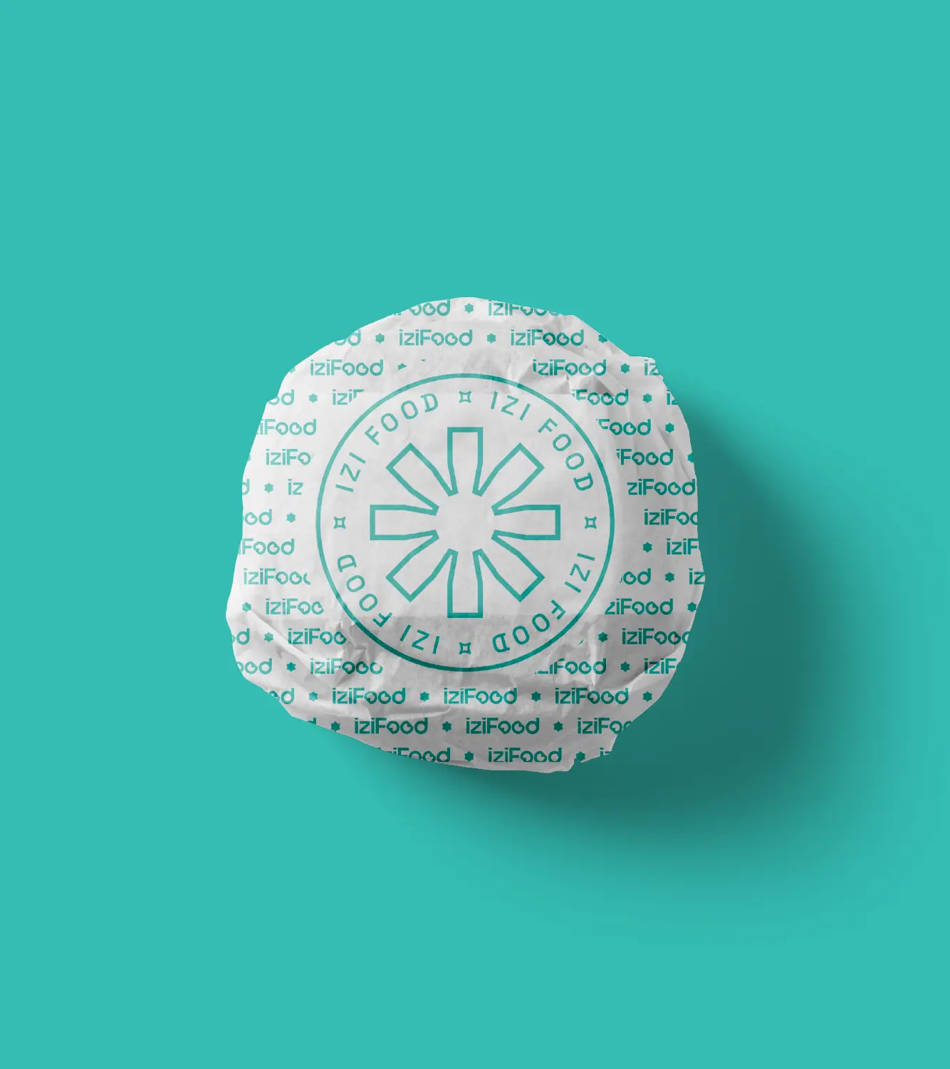
Building a brand for a pre-launch app is a gamble on the future. IziFood needed to look established before the first bike even started its engine.
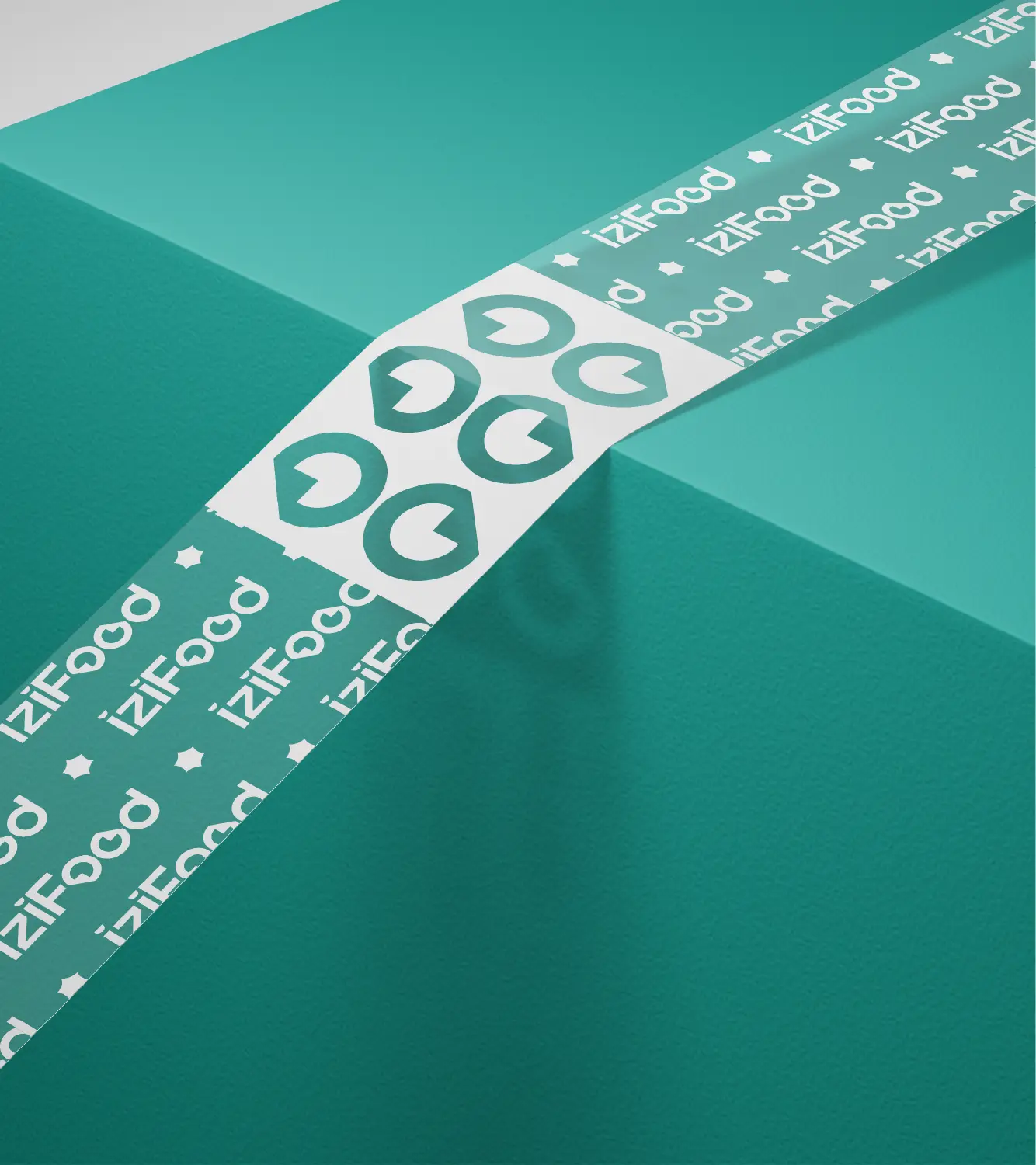
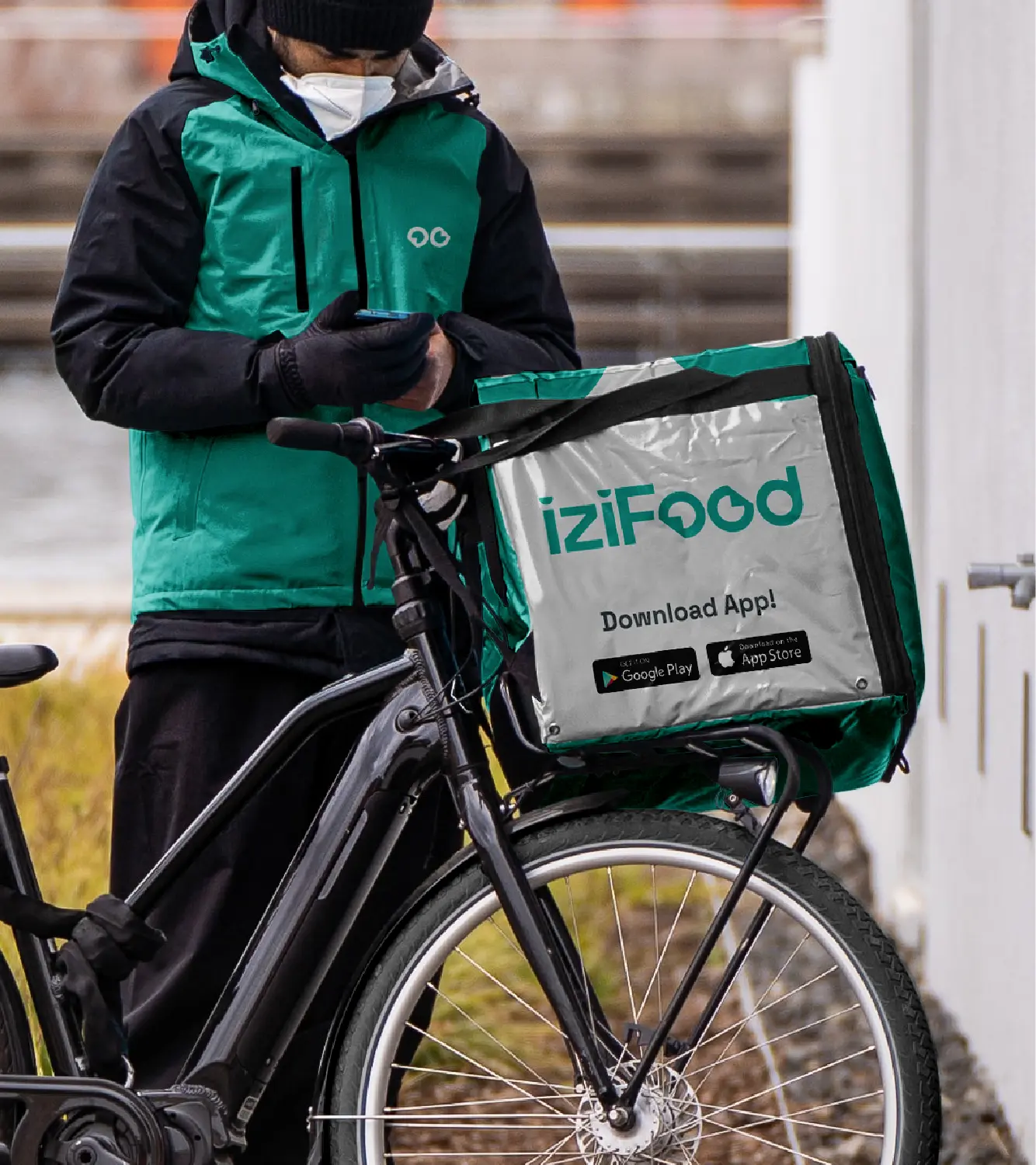
We ditched the “fast food” clichés for a fresh, professional aesthetic. By choosing a bold Turquoise palette, we solved the visibility problem before it even existed. It’s a color that cuts through the chaos of Kampala traffic.
Clean, fresh, and slightly rebellious. We traded the “greasy spoon” look for a tech-first identity that promises precision and versatility. It’s branding that looks as good on a digital screen as it does on a delivery box.