Glass and Garnish began a simple sketch on a napkin, in a client meeting… lol.
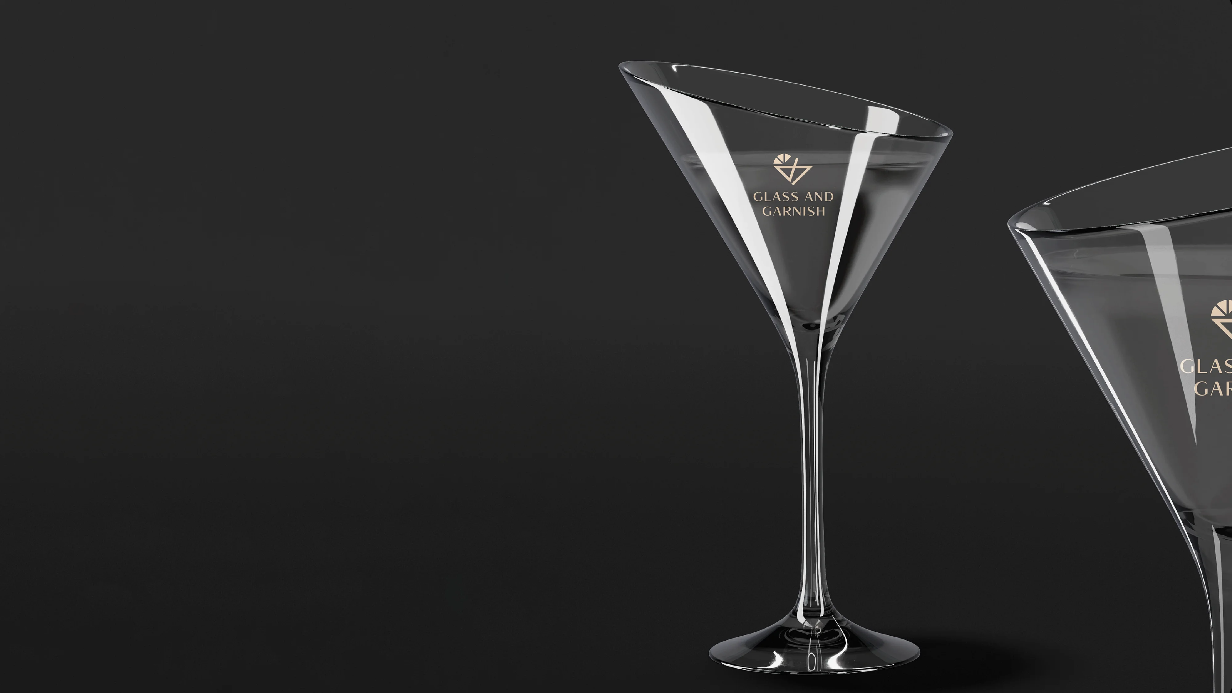
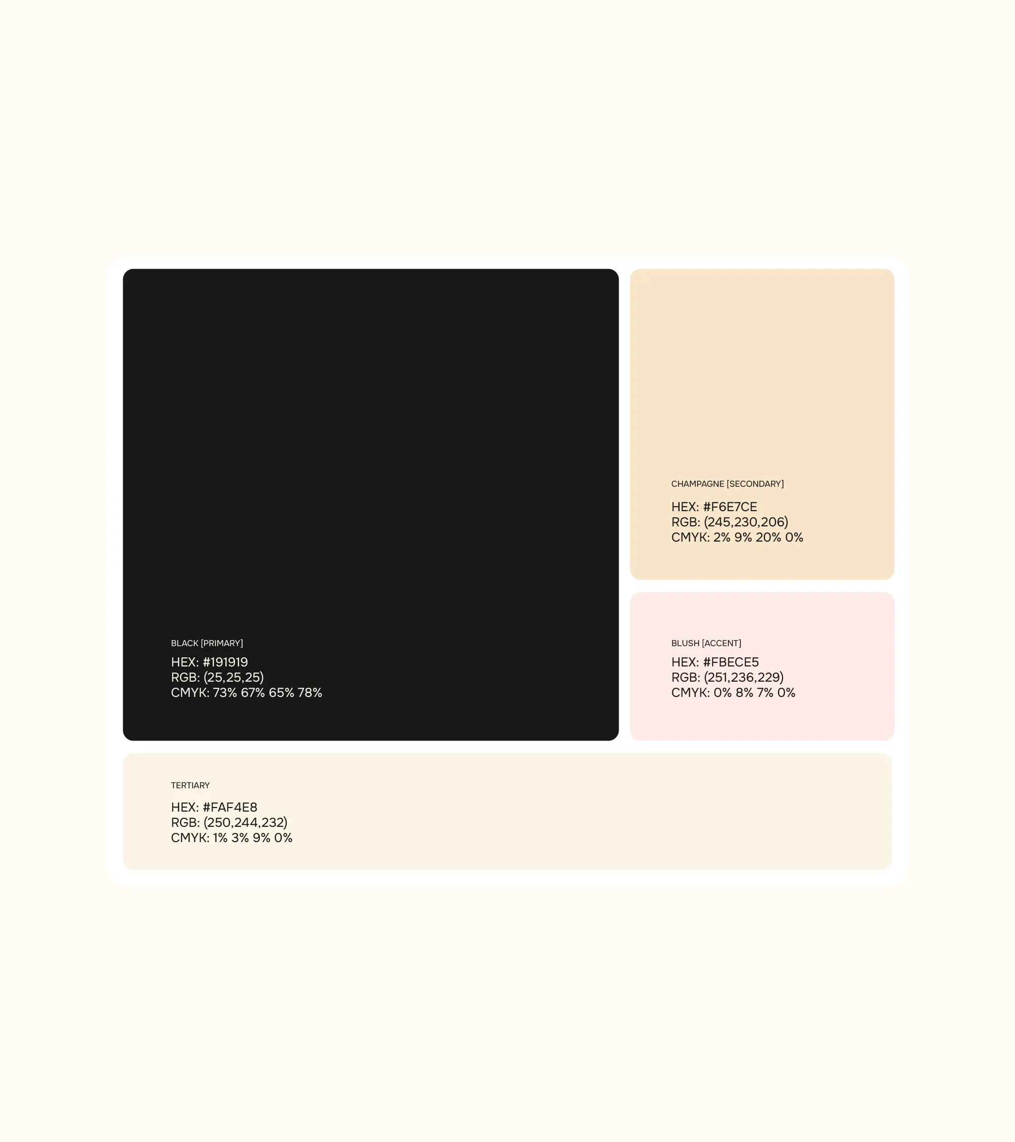
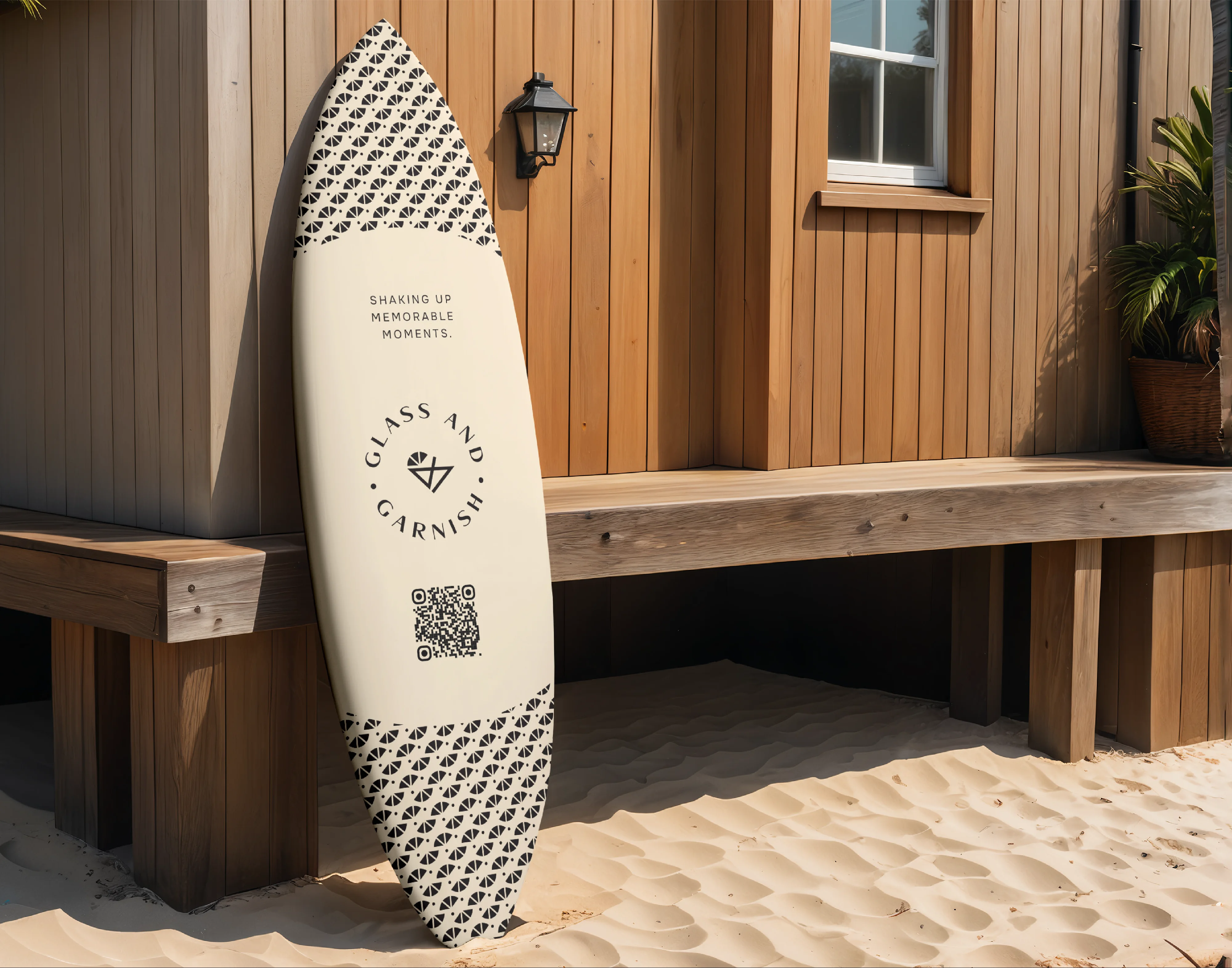
We built the mark around a cut diamond crossed with a cocktail glass, a nod to the craft and precision behind every drink, catching light the same way a good garnish catches attention. Champagne and blush tones sit against a deep charcoal black, giving the brand room to feel celebratory without tipping into loud. The logotype leans classic, all caps with generous spacing, the kind of wordmark that belongs on a napkin ring as easily as a delivery box.
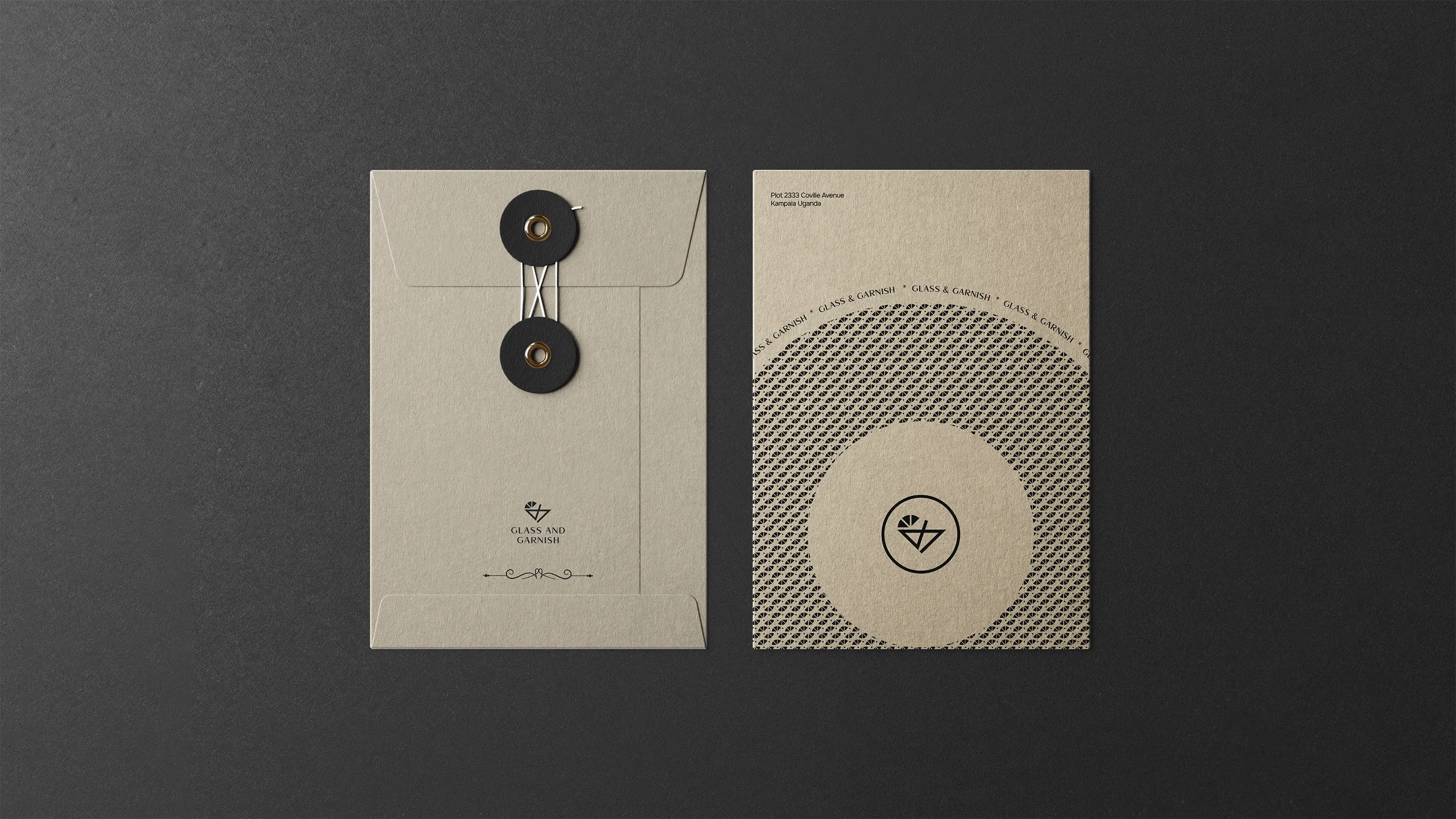
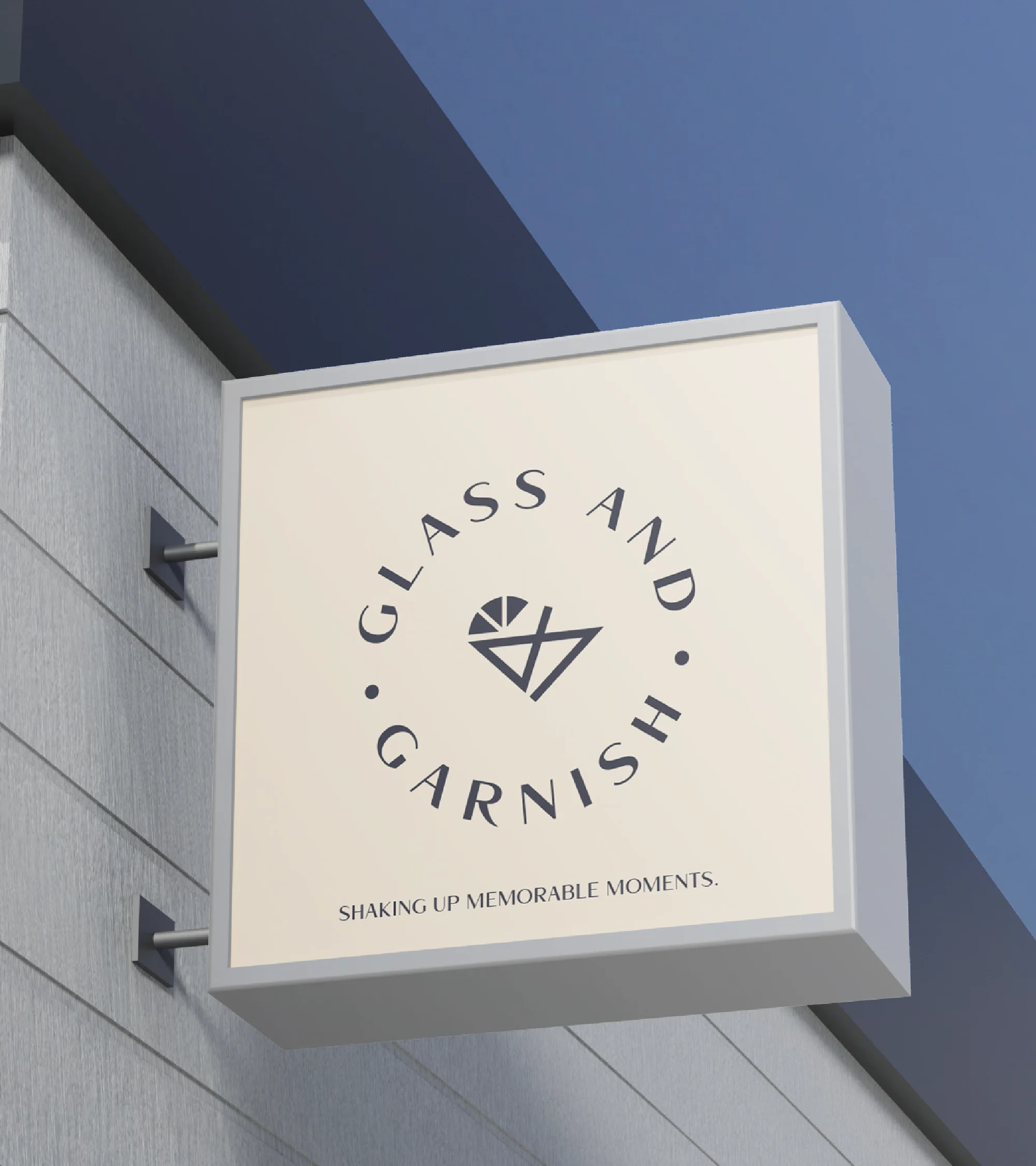
The real challenge was range. Glass and Garnish needed to work as a bar service at an intimate event and as a ready to drink product on a store shelf , so we designed a system that could stretch from etched glassware and branded packaging to apparel and signage without losing its poise. Every touchpoint carries the same quiet confidence: refined, a little vibrant, and built for the moment right before the first sip.